As I’ve mentioned before, I love Penguin Books. So, imagine my delight when I stumbled upon the website of one of their book cover designers — Coralie Bickford-Smith. It was like waking up to snow on Christmas morning. Besides having a delightful name, she also has a keen imagination when it comes to literary design. And, with her work — you can definitely judge a book by its cover.
To top it all off, she was kind enough to let me barrage her with questions over several emails in order to give you a behind-the-scenes peek at book jacket design. And — give away a lovely original screenprinted literary illustration, too!
It seems like more often than not these days, people are cutting corners, so it’s inspiring to hear of artists and companies who understand the importance of time and immersion and thoughtfulness when it comes to art.
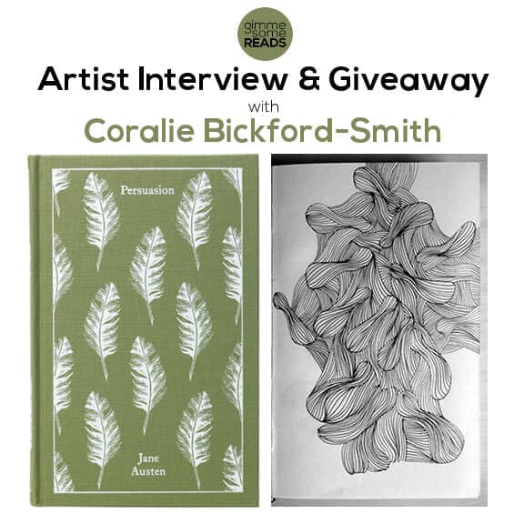
Penguin Books Designer: Coralie Bickford-Smith
After my initial email of questions, I realised there were so many things I wanted to know — and I wished I could hang out with Coralie for a day to see her process in person, but with her in London and me in Kansas City, that wasn’t possible. Thankfully, I found the next best thing: videos! So, interspersed with the interview are two brief videos from Penguin Books‘s Vimeo site that show a closer look at a few of her designs, as well as share some of her behind-the-scenes creative process.
Also, I couldn’t help but insert a few comments, so to clarify: (these are my asides).
Without further ado, here’s Coralie.
Coralie: All the things I liked as a child pointed towards one thing, and that was art and design. Early influences were a love of books, collecting books, stamps and generally admiring the qualities of printed objects. Also I used to spend hours in supermarkets looking at packaging design – I have thankfully contained this habit now. It was not until I went to Reading University and the Department of Typography and Graphic Communication that these passions made sense, and only then I realised I could get a job designing books.
Coralie: Trial and error, plenty of mistakes and some luck.
Coralie: No, it’s all filtered through our art director Jim Stoddart. He hands out the work depending on who is available and what he thinks would suit which designer.
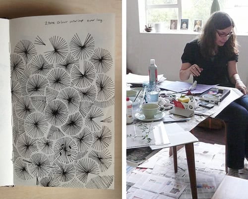
Coralie: A mess, just a lot of paper scribbled on and strewn around my desk for a while. I used to keep my initial ideas but now I am so busy they get lost and then thrown away. I don’t have the space at work to store that part of my working process. So I have to cull it. It’s a shame. I should be more strict with myself and have a dedicated notebook. I find it hard to make myself behave as I think I should because my process is essentially pretty anarchic.
(I want to start using the word “anarchic” — especially to describe my own creative process, as well!)
Coralie: Yes, I am very hands on with the production process, I work very closely with the production department at Penguin. I create my illustration to fit with certain production techniques. So much of what I can do is governed by limitations of the materials I want to use. Then, of course, the tricky balance of the budget. I like to be involved with all aspects of the cover design. If it means a trip to the printers that’s even more exciting for me.

Coralie: Yes it was my idea, always pushing production budgets that bit further…
(A beautifully designed book, plus a matching bookmark complete with a quote from the book? Brilliant.)
[The giveaway mentioned in this video is over, and not connected to Gimme Some Reads.]
Do you consider important themes? Does it change based on the book and how you’re feeling that day?
Coralie: Yes, I consider all these things when coming up with a motif or icon for the cloth classic book covers. I am always trying to do something that is not the obvious and has a connection with the text or the author. It has changed as I have progressed the series, from fabric designs popular with the era the book was written to certain objects or a just a pattern that portrays a certain theme or emotional response. Each time my approach to design is slightly different. I want to keep the series fresh and visually exciting.

Coralie: The cloth classics. I have now designed, illustrated, and art directed about 50. I work with a freelancer illustrator Mike Topping on certain titles as he has different strengths to me and it’s good to keep the pace of the illustrations exciting. These have been so popular world over it’s really quite incredible. They represent my total love of the book as an object and the pleasure of losing yourself in a good book. It also means I am much more well read than I ever was, as I have to read every title I illustrate and immerse myself in the literature. A true perk of the job.

(I remember when I first saw these Penguin cloth classics — suddenly even a brand new book could be as lovely as an old one. So, when I realised I was emailing the person who had designed so many of them, I couldn’t believe it. And on top of that, she only illustrates books after she’s actually read them! Love it.)
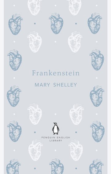
For the record, she’s also one of the main designers for the Penguin English Library, designing at least 20 of the 100 paperback books. I was particularly intrigued with Frankenstein‘s subtle colour pallete and anatomical heart design:
(I like that she used the words themselves to be the cover art; and appreciate her efforts towards authenticity by finding lines within the book to create the circled quote she wanted to highlight.)
Coralie: There is so much brilliant work that inspires me and has inspired me in the past. As a designer, I am always searching for fresh visual thinking. I never dwell long on any particular cover but kind of visually feed on everything I come across. There are certain cover designers that I check out periodically or come across their work in book shops time and time again: gray318, Peter Mendelsund, David Pearson, Barbara deWilde, and Kelly Blair to name a few.
Coralie: Philip Pulman would be top of my list. I recently got to design J.R.R. Tolkien’s Lord of the Rings, which was a life long dream. I would love to do something for a William Blake book or for a book about him.
(She illustrated Lord of the Rings???!!! I admit — I actually gasped when I read that.)
Coralie: I have been working with Samantha Johnson; we have been friends and colleagues in the Art Department at Penguin Books for almost ten years where we work on book jacket designs. We have started out on many collaborations for book covers and thought how great it would be to take certain design themes further, to be freer with our brief and follow our design ideas for other products. The result is Bickford Smith & Johnson. We can create bespoke surface pattern designs for your products or license existing designs from our portfolio. We also create limited and open editions of hand-printed screenprints for sale in our Etsy shop.
Which leads us to our giveaway!
What is Included in the Giveaway?
One lucky winner will receive:
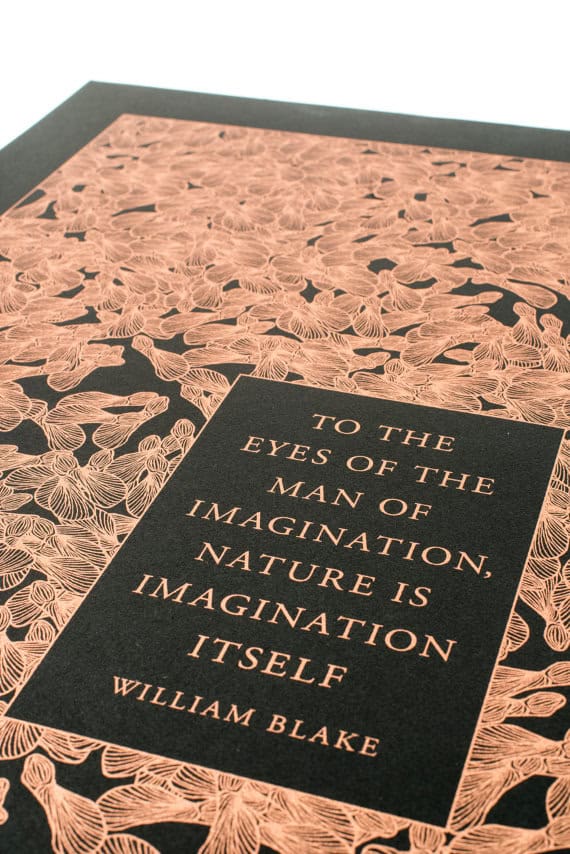
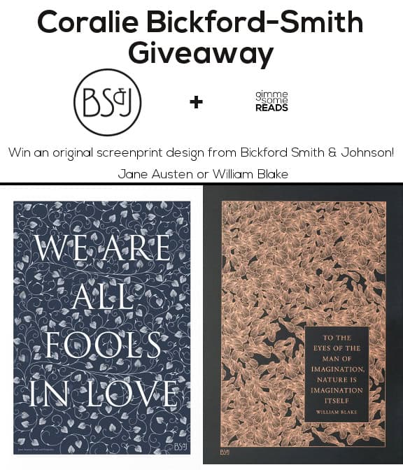
- 1 hand-printed literary screenprint of your choice from BS&J Prints:
Jane Austen or William Blake
Jane Austen print: Original pattern design printed in dark blue ink on white paper (50 x 70 cm). Features a quote from Jane Austen’s Pride & Prejudice: We are all fools in love.
William Blake print: Original pattern design, based on a single seed pod, printed with copper ink on Somerset black paper (A2: 59.4 x 42 cm). Features a quote by William Blake: To the eyes of the man of imagination, nature is imagination itself.
How to Enter the Coralie Bickford-Smith Giveaway:
Note: The giveaway will be going on through December 13th.
I like the Fitzgerald set.
Oh I love Coralie’s work. I have most of the clothbound classics and they look absolutely gorgeous all together on a bookcase. Is it bad that I have a half-formed wishlist of classics i’d love to see added to the series?
I too had to gasp a little on reading she’s designed a cover for Lord of the Rings. Can’t wait to see what she came up with (HarperCollins have actually recently brought out some clothbound special editions of the three books, but I don’t think they’re by Coralie).
Ben, if they’re the ones that just came out in November, where the spines of the trilogy create a tree, then yes — those are Coralie’s. :)
Oh are they? How brilliant. I’ve been coveting them but knowing they’re Coralie’s designs has pushed me over the edge of temptation.
Are you in the UK? B/c here in the US they haven’t yet been printed and aren’t available _at all_ for sale. :(
I love the Vanity Fair clothbound. The jewels and color scheme went together quite well.
I have personally collected almost all of the clothbound editions – all of which are beautiful.
I also have two of the Fitzgerald series and will continue to collect these as the designs are so lovely and Fitzgerald is a favourite of mine – I especially love the cover for ‘the Beautiful and the Damned’.
What I find most impressive is that the actual style of the books themselves are taken into consideration, the very design emulating the writer’s work.
A truly talented artist.
Great interview with a great designer. Fun giveaway too!
Thanks, Siobhan! :)
I am a huge fan of these editions. I love thoughtful book design and I’ll always pay a little extra for something with bookshelf staying power. I really like her “Crime and Punishment” cover.
Agreed, Amy! I too am intrigued by her Crime & Punishment. Didn’t get a chance to ask her, but I see it like the maze of the main character’s mind — or perhaps the routes he would walk over and over.
As beautiful as the Clothbound Classics covers are, I’d say that the ‘Books for Boys’ range is more visually grabbing. I saw “The 39 Steps” and “Greenmantle” by John Buchan in the Southbank book market, and had already parted with my money before I even read the blurb! Seeing the colour spectrum of the full set online makes me want to own them all.
I hadn’t fully checked those out as I got sidetracked with cloth classics & Penguin English Library books. But I can see why they grabbed your attention…and your money! :) I love The Man Who Was Thursday design — and book. :)
I love the cloth bound series! Particularly the Alice in Wonderland with the cute flamingos.
Beautiful work. My favourite of Coralie’s designs are the F. Scott Fitzgerald series. The matching bookmarks are a really nice touch. The sycamore seeds are a lovely motif for the William Blake print as well.
Aren’t they stunning? I really want her Fitzgerald series now. I already have three different paperbacks of The Great Gatsby, but… :)
I really like Coralie’s designs for the Fitzgerald and Cloth Bound Classics series, but have to give a mention to the English Library edition of Dracula. Coralie ran a giveaway to new followers on her Twitter, but i already followed her, so she sent me one any way!
:)